Falmouth Learning Space will be undergoing a major upgrade in the summer. This update focuses on major user experience improvements – a redesigned visual experience.
What’s changed?
- Main menu has moved to the top leaving the left hand menu dedicated to your course content.
- Grades / Course Tabs – these appear beneath your module title. Previously grades was a button in the left hand menu.
- Course Menu now includes additional items previously accessed via the ‘cog’ icon.
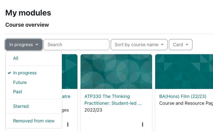
- Home / My Modules Page – this has a more visual look and allows you to search and filter by current, past or future modules.
- Label Activity – you have likely used the label activity in your courses to insert additional text or images. It is now called Text and Media and works in the same way.

Improved Accessibility
Learning Space is powered by Moodle 4 which underwent an accessibility audit against the WCAG 2.1 AA standard and achieved formal accreditation, announced in May 2023.
Moodle’s Accessibility page is regularly updated with details on updates and improvements.
For context, the update from WCAG 2.1 AA to WCAG 2.2 AA mainly focuses on compliance with web accessibility on touchscreens and mobile platforms and specifically, it aims to improve accessibility for:
- Users with low vision
- Users with cognitive limitations or learning disabilities
- Users with restrictions like large fingers or motor disabilities that make using mobile devices challenging
Supported screenreaders
- NVDA Screen Reader (Windows)
- JAWS Screen Reader (Windows)
- Chromevox Screen Reader (Linux, Chrome OS, Windows, Mac OS X)
- Orca Screen Reader (Linux)

Updated: Home / My Modules Page
Get to My Modules by clicking the Learning Space logo at the top left of the page.
Now filter by in progress, future and past. Also options to star modules. You can quickly search through them and view as a list or as cards.

Course / Grades Pages
- Grades button is now at the top of the page rather than in the left hand menu.
- The left-had side menu is less cluttered, with a focus on module content.
- Your position within a module is highlighted on the left-hand menu as you scroll through.
- The left-hand side menu can be hidden if needed.

Help
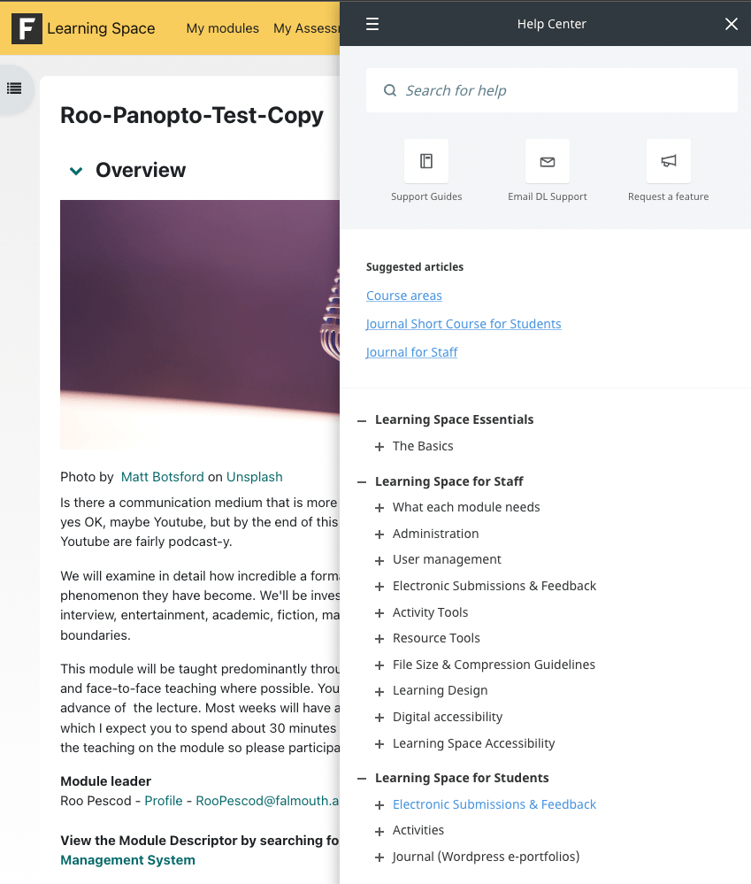
The Help Centre can still be found at the top-right of every page. Click the question mark to expand and search our Digital Learning Solution guides.

For Staff – Editing Pages
- Editing a module works in much the same way – there is now an easy to see ‘Edit’ toggle at the top-right of your module page.

Activities / Resources
These now have a larger button at the bottom of each section

Add sections
Simply scroll to the bottom of a section in your course to see the new Add sections button

