With increasing pressures on HEI’s to accomodate increasing student numbers and enabling wider access to learning, a fully online or blended delivery is becomming a popular means to manage this.
With reference to modern web design, we take a look at some considerations for appropriate online learning content.
Screen real estate
It’s really important to make content that meets the needs of our learners as quickly and efficiently as possible.
A recent survey suggests that our current cohort of students exist in a “a world that offers them instant access nearly everywhere to nearly the entirety of human knowledge, with incredible opportunities to connect, create and collaborate” and as such any content we produce must get our learners’ attention as quickly as possible, and hold it for as long as possible. We must make important information available up front, leaving lesser or secondary information until later; such as further down the page, or on secondary pages. We can also omit decorative or non-content elements, such as decorative images, allowing students to focus easily on the content that matters to them the most.
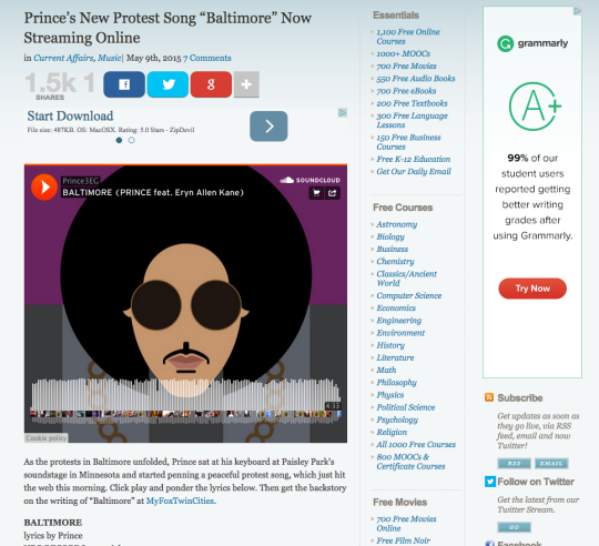
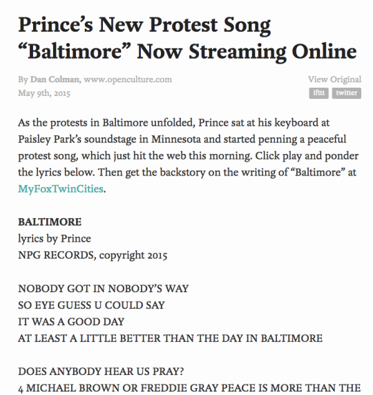
Here’s an example of how bookmarking tool Pocket takes article content from a site and re-fromats it without any additional ‘noise’ from the original post.
Writing for the web
We tend to be less comfortable reading online, so it’s important our writing communicates efficiently.
Keep texts short
Keeping word count to a minimum is a good way of increasing reading speeds, which tend to be around 25% slower online. Reduce by half, and then half again.
The guiding voice
Humour and attitude play an important role in information retention. By using our own voice, we can guide learners through our content in a personal and human way to help develop their understanding of the ideas and concepts we are presenting.
Writing in a language the audience understands
Avoid use of “eduspeak”, acronyms or unfamiliar terms when writing learning content. Learning outcomes or assessment criteria should be clear and easy to understand and may need to be translated from institutional lingo to modern language appropriate to the audience.
Scannable content
Around 79% of people scan web pages on the first visit and ascertain whether the content is relevant. By designing content that is easy to scan, we make it easier for learners to pick out, analyse and synthesise relevant information.
Be concise
When writing text, reducing word count by around half is known to increase a user’s ability to scan. You may be able to remove unnecessary words (often adjectives and adverbs) without the text losing meaning.
Scannable layout
A scannable layout can be achieved using properly formatted content, using elements such as headers, bullets and lists.
- Headers, given appropriate titles, can aid readability by being informative and acting as a resting place for the eye whilst scanning.
- Bullets can be used to clump important ideas together, whilst keeping the word count to a minimum.
- Numbered lists can be used where the number of bullet points becomes excessive, aiding readability and information retention.
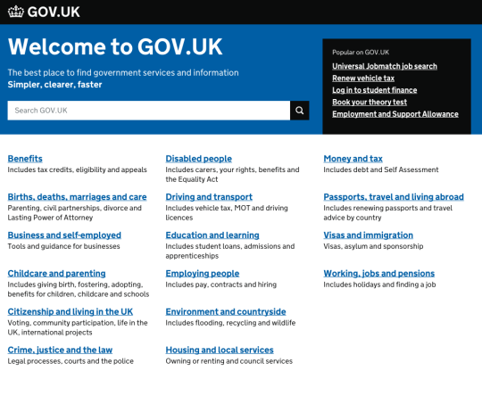
The online presence for the UK government is a good example of minimal content that is in a language that users understand.
Page titles
Page titles play an important role in the navigation of online content. Provided they are given an informative title, they explain what will be found of the page.
An optimal page title, designed for quick scanning, should include information-carrying terms towards the start, beginning with a word that meets the learner’s immediate needs. Page titles should also be around 40 – 60 characters in length, aiding scanning.
Page titles need not be grammatical sentences, and may read more like advertising slogans drawing people to the content and maximising impact.

Mobile-friendly content
It is important to consider the constraints as well as the affordances of mobile devices to make sure the content we produce is always available to, and consumable by, our learners.
Large and unnecessary images are one of the main culprits for a poor mobile reading experience. Due to slower mobile download speeds, it is important that images be information-carrying and of importance to the user, and optimised to allow them to be downloaded as quickly and efficiently as possible.
Screen size also affects our reading ability online. Secondary material should be linked to as ‘extended reading’ or omitted altogether.
The context of mobile use also means that learners expect content to be instantly available, so ensuring content is concise and scannable means learners can engage at a time and/or place suitable to them.
The process of making our content adaptable will benefit learners using a range of devices; phones, tablets, laptops, desktops, so the benefits outweigh the cost of designing mobile friendly content.
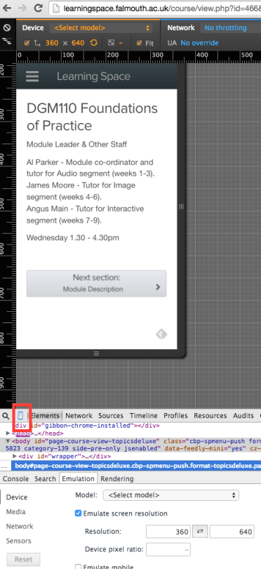
If you don’t have a mobile device to hand, the emulation mode available in Google Chrome allows you to view content as you might see it on mobile.
Images
As mentioned, use of images should be minimised due to download speeds, especially on mobile.
Eye tracking studies have shown that images with little or no use are simply ignored by learners; therefore decorative or non-informative images should be omitted from your content. However, learners do want to see images containing important information; a course/module introduction might contain an image that represents the theme and engages the learner in the same way that a Title might.
Avatars or profile pictures are also known to positively affect user behaviour online, as they add a human touch that is often missing in online content. This is particularly relevant to fully online courses, who might make use of Forums for posting content.
Including meta-data, such as an image description within images posted on the web aids accessibility and means those with slower internet connections or who make use of screen readers get useful information about that image.
Video
Like images, internet bandwidth must be considered for use of video. Home based/Off campus learners may be relying on mobile internet speeds to access content and whilst they may be able to view a one minute introduction to the course/module, they may not be able to view an hour long lecture recording or interview.
Video is a good way of giving the learner a sense of personality and to introduce your voice. Avoid “talking heads” and opt for showing movement in video, as this adds to the user experience and gives context. A Screencast may be able to explain a concept much better than presenting it in a lecture and allow learners to follow along at their own pace.
[vimeo 75034342 w=540 h=338]
However, video may be more expensive and time-consuming to produce, compared to other content types, so consider whether another mode of delivery might do the same job. Also, due to the visual nature of video, audio quality is often overlooked, making for a frustrating experience; spoken word may be more difficult to understand and becomes a problem, particularly for those with impaired hearing or non-native speakers. Consider making use of closed-captioning to make the video more accessible.
Audio
Audio is a welcome and often overlooked alternative to text content on screen as it provides a separate channel to the visual information on the page.
Audio can often supplement commentary or help information, without obscuring any visual elements that the user may be interacting with.
Using voice overs, we can give a sense of personality to what might otherwise be monochrome text
As well as being an alternative to text, audio may be more favourable than video due to the lower production costs.
Staff at Falmouth University can subscribe to this module to find out more about presenting content in Learning Space.